

Hey, Requiply community! First update of 2026. Meet the Analytics page!
Now you can see not just what's happening with your bookings, but understand how your business actually performs: what generates the most revenue, how efficiently your equipment is being used, and whether customers come back to you.
What's on the Analytics Page?
The page consists of eight key metrics and visualizations that give you a complete picture of your business for any selected period.
All data can be viewed for different periods: current month, previous month, current year, previous year, or a custom date range you set.
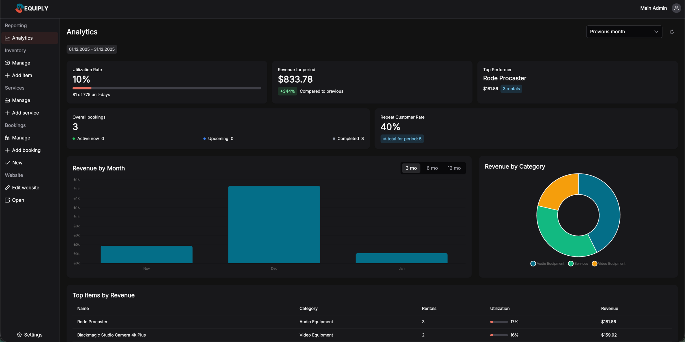
1. Utilization Rate
Utilization rate shows how efficiently your inventory is being used. It's the percentage of time your equipment was rented out relative to total available days.
How it works: If you have 10 units of equipment and the month has 31 days, that's 310 total unit-days. If 62 unit-days were rented during the month, your utilization rate is 20%.
Why it matters:
- Low utilization might mean you need more marketing or a pricing review
- High utilization signals you might want to expand your inventory
- Tracking the trend helps you plan for seasonal fluctuations
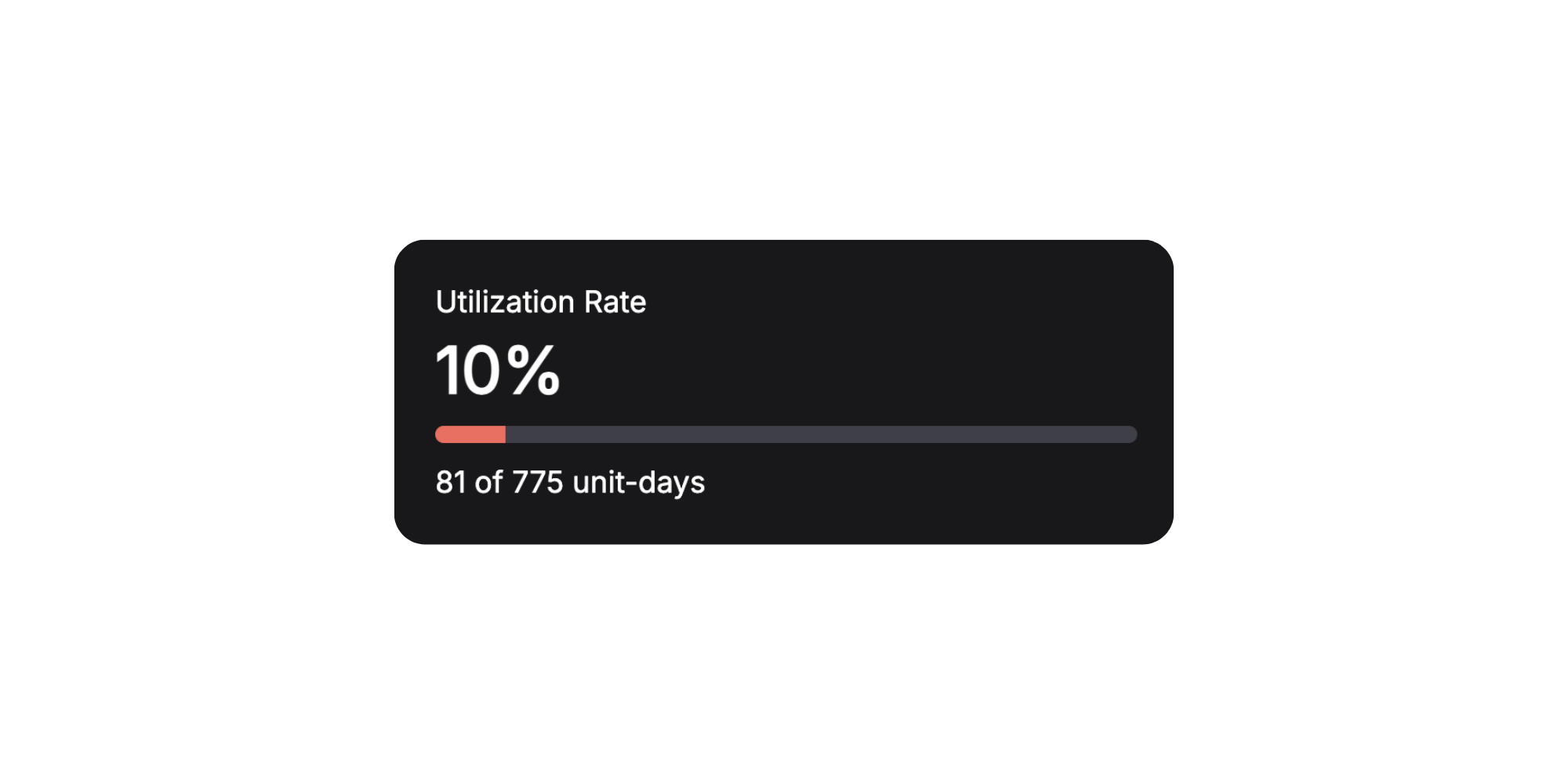
2. Revenue for Period
The main number every business owner wants to see — how much money the business earned during the selected period.
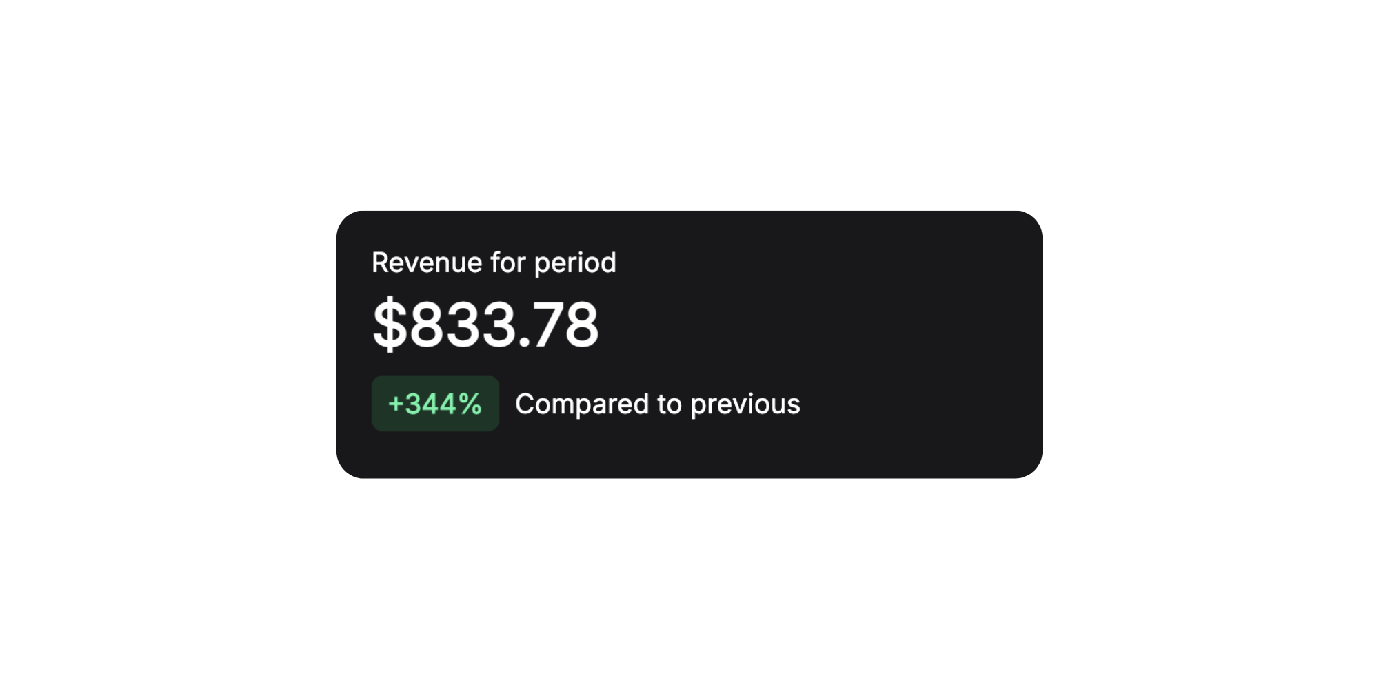
3. Top Item
See at a glance which inventory item generated the most revenue during the selected period.
Practical applications:
- Identify your "stars" — equipment worth promoting more actively
- Consider purchasing more units of popular items
- Understand what your customers value most
4. Total Bookings
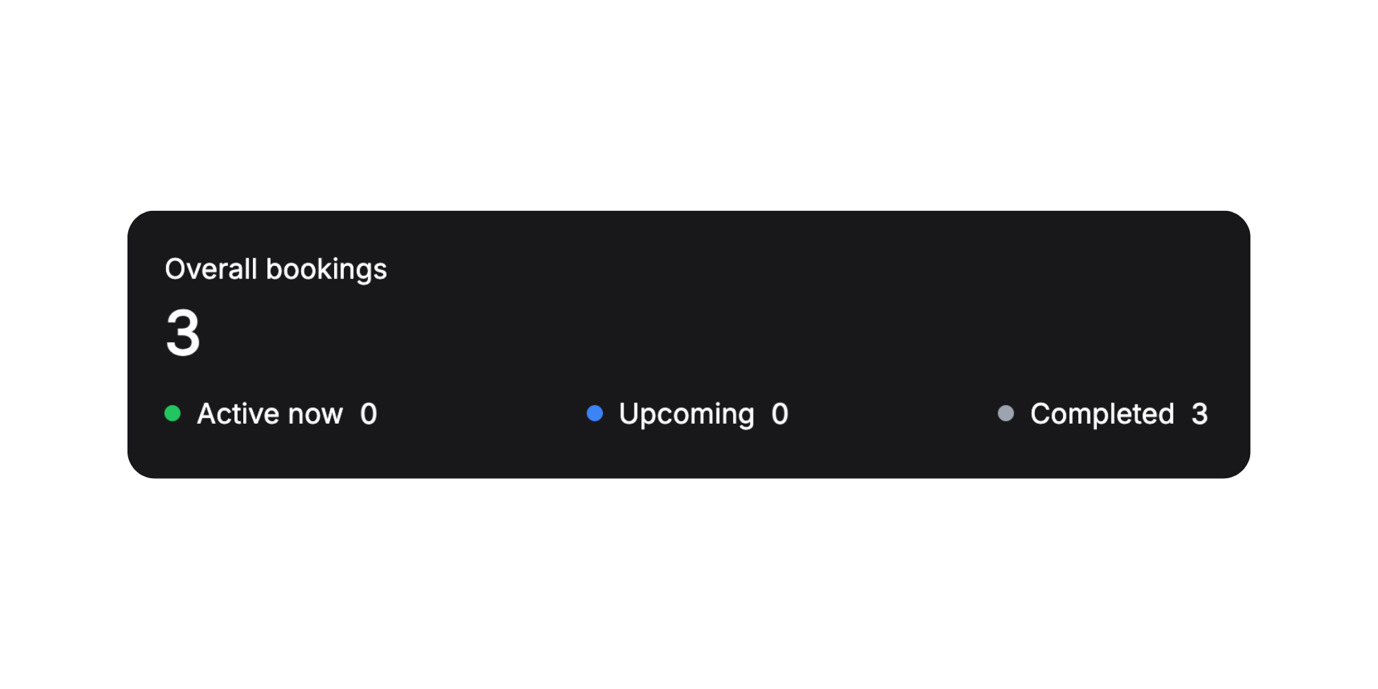
A complete picture of booking activity for the period with breakdown by status.
This metric helps you plan workload. If you see many scheduled bookings — prepare for a busy period. If there are many completed but few new ones — time to step up customer acquisition.
5. Repeat Customers
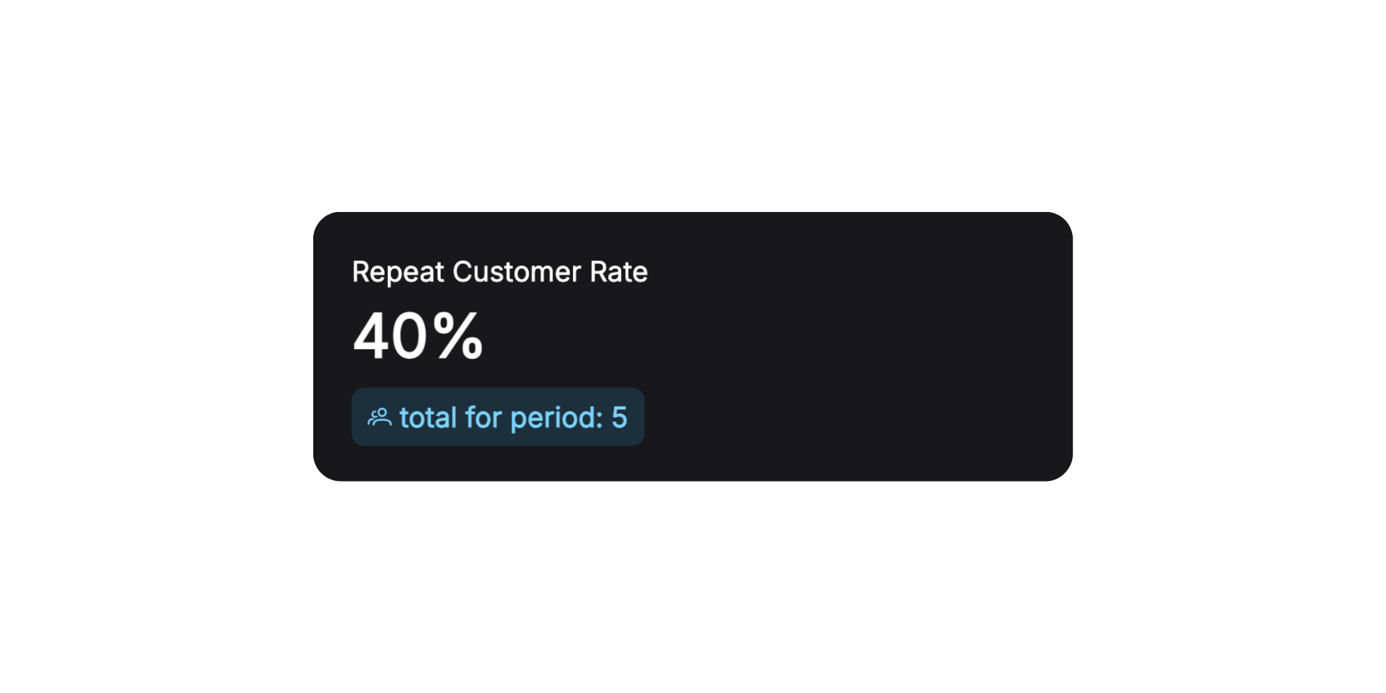
One of the most important indicators of a healthy business — whether customers come back to you.
6. Revenue by Month
A visual bar chart showing revenue dynamics month by month.
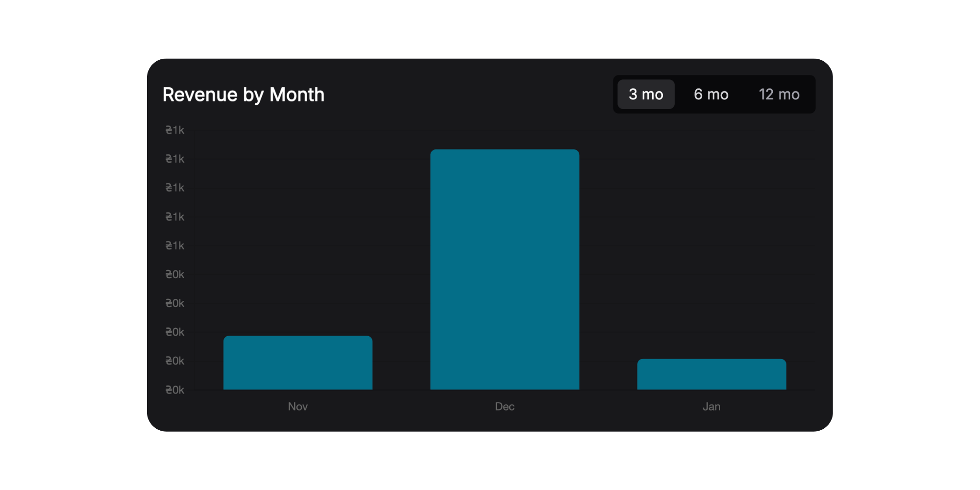
This chart is perfect for identifying seasonality. You'll immediately see which months your business is more active, and can plan marketing and purchases accordingly.
7. Revenue by Categories
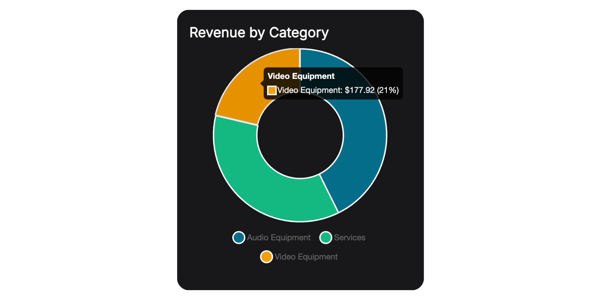
A pie chart showing revenue distribution across your inventory categories and services.
Example insights:
- Photo/video equipment rental: See that cameras bring 60% of revenue while lighting only 10% — maybe it's worth expanding your camera selection
- Tool rental: Power tools dominate — focus your marketing on this category
8. Top Items by Revenue
A detailed table with all inventory items, sorted by revenue.
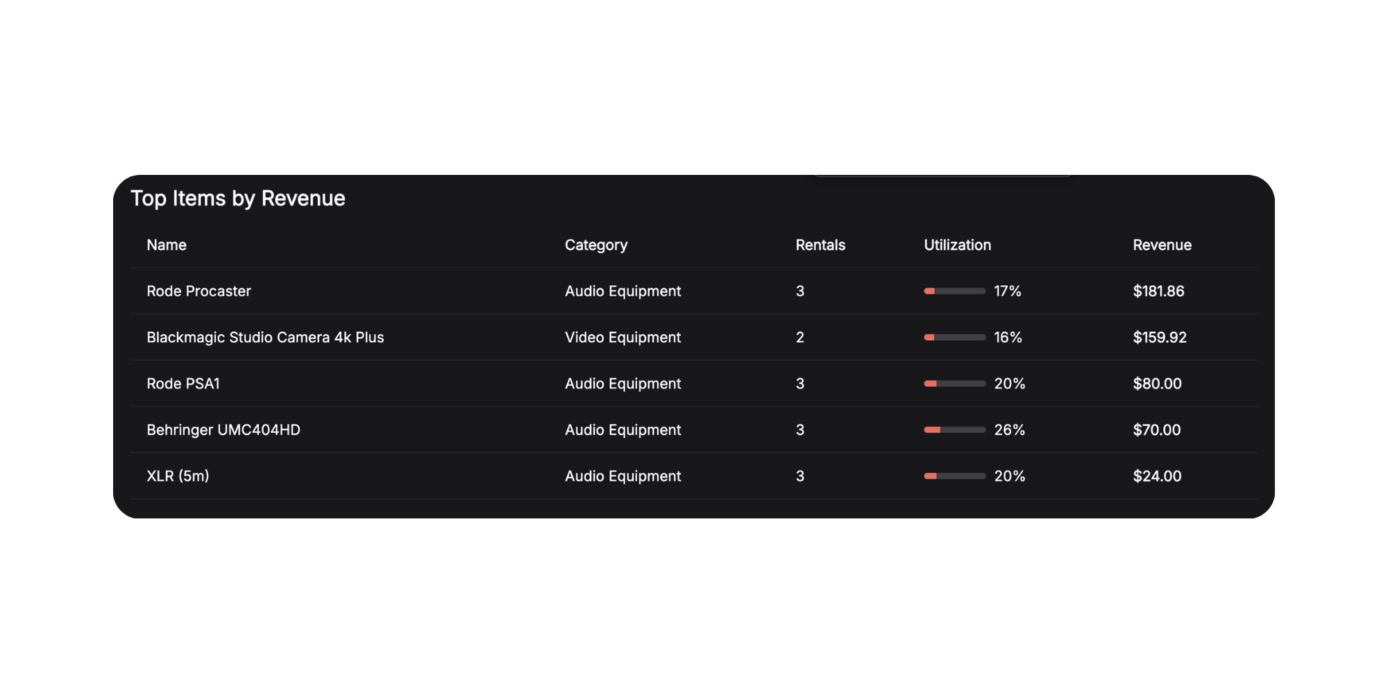
This table is your detailed report on the performance of each inventory unit. Here you'll see not just the leaders, but also the underperformers — perhaps there's equipment worth selling or promoting more actively.
What's Next?
Our next step is Employees & Team. You'll be able to add team members, assign them to perform services, and see who earned how much for the company.
Your feedback shapes what we build. What metrics would you like to see in analytics? What's missing for a complete picture of your business?
Have questions or suggestions? Write to us at info@requiply.com — we're always happy to hear from you!